Glow Stop
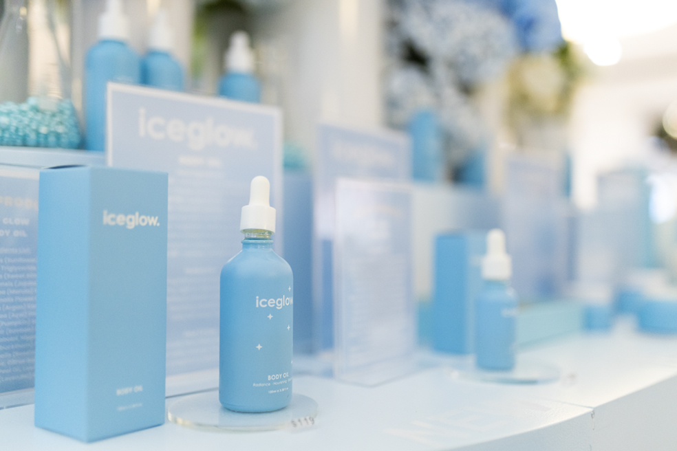
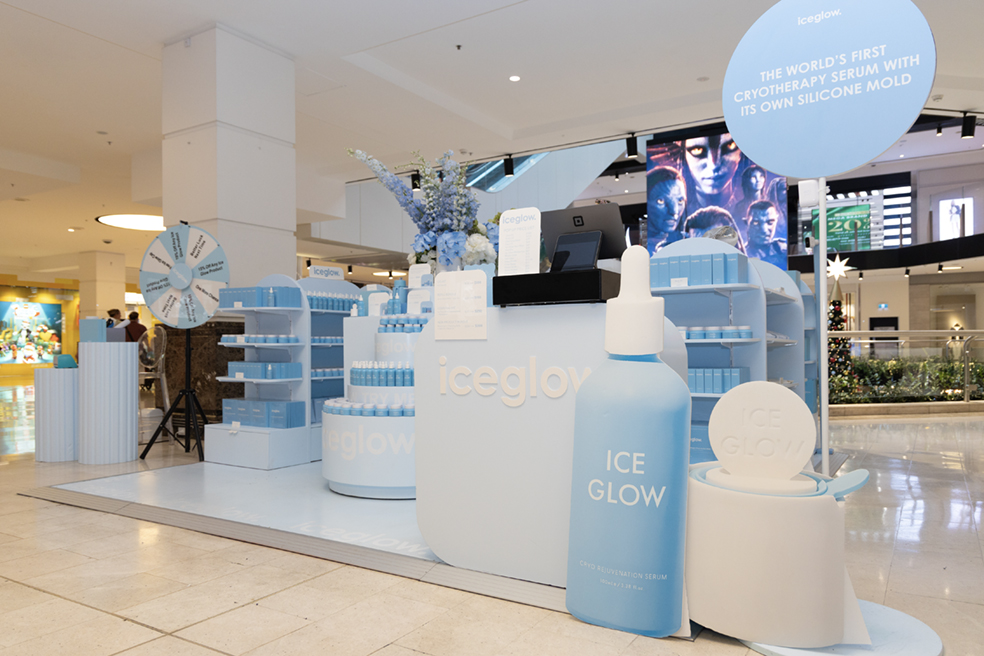
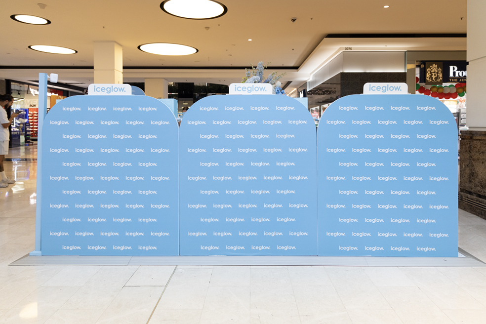
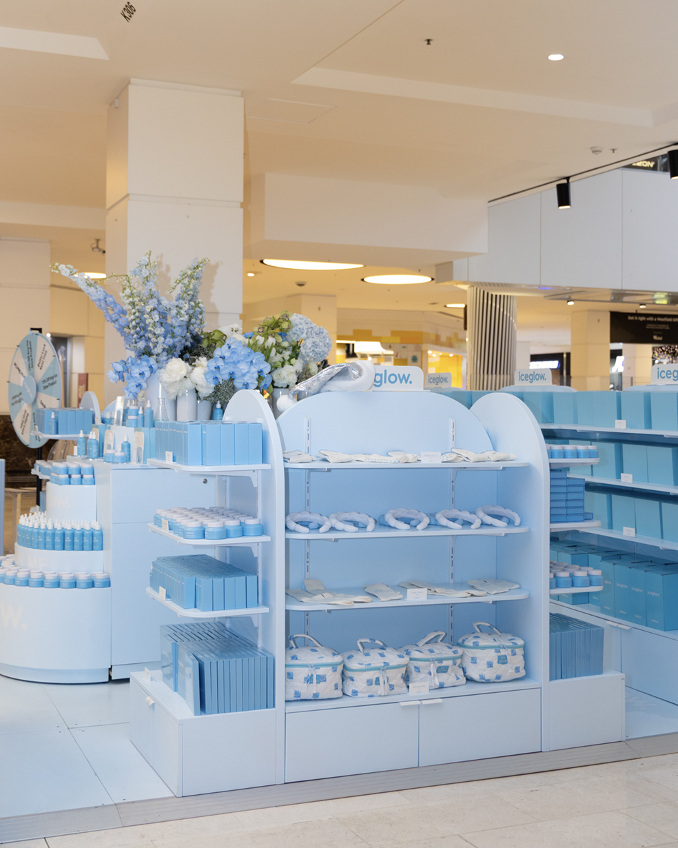
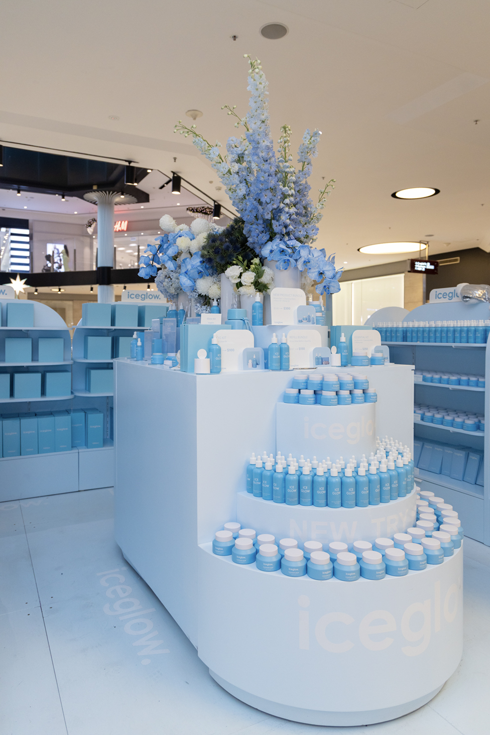
Iceglow brought its signature glow to Parramatta with a vibrant pop-up designed to stop shoppers in their tracks. Finished in Iceglow blue, the space featured a Counter, Cakey Counter, Gondolas, a Lollipop Sign, and a set of Fomo Plinths highlighting hero products.
The pop-up delivered a bold, immersive brand moment while inviting customers to browse, test, and engage with the full range. Clear sightlines, smart zoning, and considered fixture placement maximised display space without feeling crowded. Together, colour, form, and layout amplified Iceglow’s fun, youthful energy and ensured strong visibility, accessibility, and impact within a compact retail footprint.
WHAT THE CLIENT NEEDED
Iceglow needed a pop-up space that could showcase a wide product range while remaining visually impactful and unmistakably on-brand. The environment needed to feel bold, fun, and instantly recognisable, capturing attention within a busy retail setting.
Functionality was essential. The layout had to support clear product display, smooth customer interaction, and efficient staff operation without feeling cluttered or overwhelming. Strong brand presence was also a priority, with colour, form, and signage working together to reinforce recognition. The goal was to create a memorable retail moment that attracted passersby, encouraged engagement, and supported seamless browsing for shoppers moving through Parramatta.
The Glow Blueprint
We saw the Iceglow pop-up as an opportunity to turn product display into a visual statement. Our thinking focused on creating a layout that balanced playful design with clear functionality, allowing the products to remain the hero. By committing fully to Iceglow blue, we ensured instant brand recognition from a distance while sculptural elements like the Fomo Plinths and Lollipop Sign added personality and energy.
We wanted the space to feel open and approachable, encouraging customers to step in, browse, and engage. Each fixture was designed to serve a clear purpose, guiding customer flow, highlighting key products, and supporting staff interaction without overwhelming the footprint. The overall experience needed to feel intuitive, fun, and bold while remaining effortless to navigate.
This approach ensured the pop-up felt cohesive, memorable, and engaging, translating Iceglow’s playful brand personality into a physical retail environment that invited discovery and encouraged meaningful product interaction for shoppers.
How We Activated
We delivered a custom Iceglow pop-up featuring a central Counter and a Cakey Counter to support interaction and transactions, while gondolas around the perimeter maximised product display. Fomo Plinths were strategically placed to highlight hero products and new launches, creating moments of discovery that encouraged customers to explore the space.
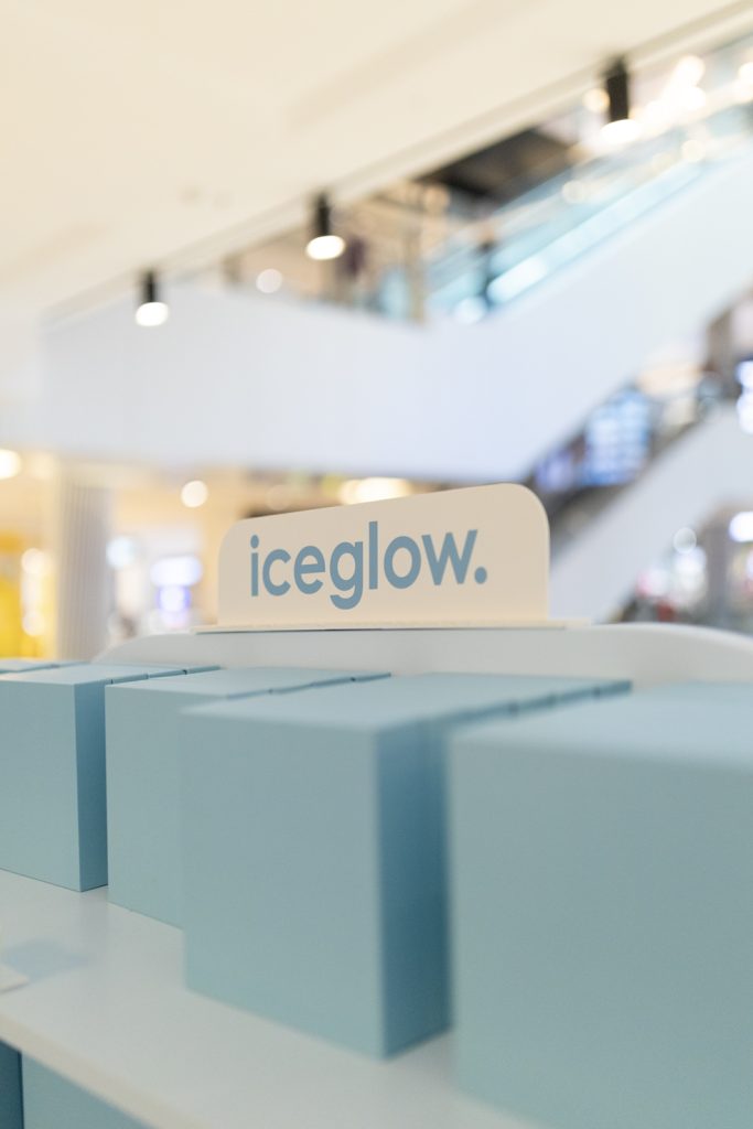
An oversized Lollipop Sign acted as a playful visual anchor, drawing attention from afar and reinforcing Iceglow’s fun, youthful brand identity. Every element was wrapped in Iceglow blue to create a cohesive and high-impact visual statement.
The layout was carefully designed to maintain clear sightlines, smooth customer flow, and easy staff operation. The combination of colour, form, and fixture placement ensured the space felt open, welcoming, and immersive while still accommodating a broad product range. The result was a pop-up that was visually striking, functional, and true to Iceglow’s energetic, playful personality.